Design your own Home Assistant buttons in HTML and CSS
Standard cards and most custom cards give you a fixed set of options. With HTML Action Card you write the button the way you imagine it, in plain HTML and CSS, and connect it to Home Assistant with a few attributes. No YAML option tree to learn, no extra card per design.
Or in HACS: ⋮ → Custom repositories → https://github.com/davidrot/ha-html-action-card, type Dashboard.
How it looks
A counter you tap
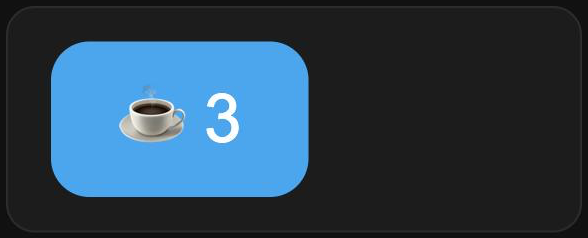
<style>
  button { font-size: 28px; padding: 14px 28px; border: 0; border-radius: 16px;
           background: var(--primary-color); color: white; cursor: pointer; }
</style>
<button data-action="counter.increment" data-entity="counter.coffee">
  ☕ {{ counter.coffee.state }}
</button>
A lamp that shows its state
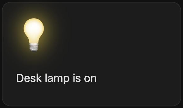
<style>
  .bulb { font-size: 48px; cursor: pointer; filter: grayscale(1) opacity(.4); }
  .bulb.on { filter: drop-shadow(0 0 14px gold); }
</style>
<div class="bulb {{ light.desk.state }}"
     data-action="toggle" data-entity="light.desk">💡</div>
<p>Desk lamp is {{ light.desk.state }}</p>
What you can use
{{ entity.state }}and{{ entity.attributes.x }}for live values, also insideclassandstyle.data-actionfor services,toggle,more-info,navigateor a URL.data-eventfor tap, hold, double tap, press-and-repeat or release.data-show-ifto show elements only in some states, anddata-confirmto ask first.- Your theme's colours through Home Assistant's CSS variables, such as
var(--primary-color).
See all building blocks in the README, or start from a card in the showroom.